Dashboard analytics
The home dashboard gives you a live view of your campaign performance, sending fleet health, and recent replies - all from one page.
Overview
The dashboard is the first page you land on after signing in. It lives at /dashboard and is labeled Your Dashboard in the page header. It has two main areas:
- Summary cards - three side-by-side cards showing your active campaigns, email delivery fleet, and recent replies.
- Analytics chart - a time-series chart with six metric pills you can switch between, a date range picker, and a cumulative toggle.
The dashboard is designed for anyone checking campaign health daily: campaign managers reviewing send volume and reply rates, and infrastructure leads monitoring inbox and domain counts.
Before you start
- You must be signed in to an active workspace. If no workspace is active, the page shows an "Access Blocked" message instead of data.
- Some summary card data (inbox counts with active subsets) requires a backend version that ships the
activeInboxesandactiveDomainsfields. If those fields are not yet available, the "· N active" suffixes are omitted gracefully - the totals still display.
How to use the dashboard
Reading the summary cards
The three cards at the top of the page load as soon as you open the dashboard.
- Open
/dashboardfrom the sidebar. - The Campaigns card lists your most recent campaigns. Each row shows a completion percentage, the campaign name, and an estimated "Completes in N days" value. Click any campaign name to go directly to that campaign's detail page.
- The Email Delivery card shows your total inbox count, domain count, and the inboxes-per-domain ratio. Each total is a link. For example, clicking "1720 Inboxes" takes you to the Delivery page filtered to all inboxes. If active counts are available, a muted "· N active" link appears next to each total - clicking it takes you to the same tab pre-filtered to active items only.
- The Recent Emails card shows your three most recent unread replies. Click any row to open that thread in the Replies page. Click View All to go to the full Replies list.
To start a new campaign directly from the dashboard, click Create New in the Campaigns card header.
Reading the analytics chart
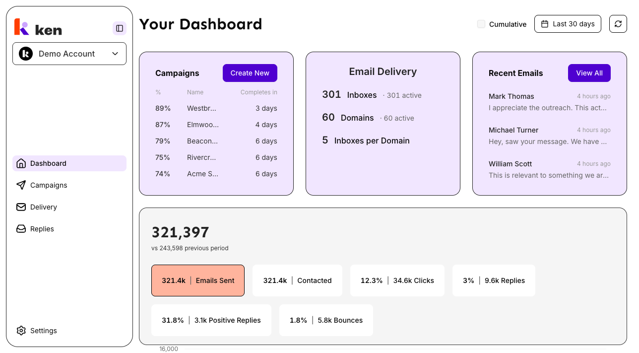
The analytics section sits below the summary cards. It shows a time-series chart for the metric you have selected.
- The chart defaults to the Last 30 days preset and the Emails Sent metric.
- To change the date range, click the date range picker in the header and choose a preset (for example, "Last 7 days", "This month", or "Last 3 months") or set a custom from/to date. Preset labels are relative - "Last 30 days" always resolves to today minus 30 days, not a frozen date.
- To switch the charted metric, click one of the six metric pills to the right of the summary number:
- Emails Sent - total emails sent in the period
- Contacted - unique contacts reached
- Clicks - human link clicks (bot/scanner traffic is excluded from the headline; hover the pill to see a Campaign / Direct / Bot breakdown)
- Replies - reply rate percentage (absolute count shown inline as "N | Replies")
- Positive Replies - positive reply rate percentage
- Bounces - bounce rate percentage
- The large number above the chart is the total or rate for the selected metric in the selected period, compared against the previous period of equal length ("vs N previous period").
- To toggle between a daily and a cumulative view, check or uncheck the Cumulative checkbox in the header.
- To force a refresh of all dashboard data, click the refresh icon button in the header (next to the date picker). Hover the icon to see when the data was last updated.
How it works
The dashboard uses a two-layer cache so pages open instantly without spinners.
Server-side hydration. When you first navigate to /dashboard, the server pre-fetches the analytics, cards, and recent-emails data before sending the page to your browser. You see numbers immediately on the first paint - no loading state on a cold visit.
Browser persistence. After the first load, the data is saved to your browser's local storage. When you reload the page or return to it after closing and reopening the tab, the saved data is shown immediately while a quiet background refetch runs to update it. Data marked stale (older than 5 minutes) is refreshed automatically. Email delivery data is cached for up to one full day because the underlying infrastructure queries are expensive.
Per-user isolation. The cache is tied to your account. If a different user signs in on the same browser, the previous user's data is cleared synchronously before the new user's data is loaded - there is no window where one account can see another's numbers.
URL-backed view state. The selected metric, date preset, custom date range, and cumulative toggle are all stored in the URL. Bookmarking the dashboard URL or sharing it with a teammate opens the same view.
Deep-link navigation from cards. The Email Delivery card counts are not just display values - they are navigation links. Clicking a total routes to the corresponding tab with status=all (for example, /delivery?tab=inboxes&status=all for the inbox count), which clears the status filter but keeps any provider or tag filters you had set. Clicking an "· N active" suffix routes to the same tab with status=active (for example, /delivery?tab=inboxes&status=active), which pre-applies the active filter. The dashboard itself does not manage Delivery page filters - it only writes a URL, and the Delivery page reads the ?status= parameter and seeds its own filter on mount.
Number formatting. Large counts are abbreviated (1,300 displays as "1.3k"; 2,500,000 as "2.5M"). Rate metrics like Replies and Bounces are shown as percentages (0-100 scale, already calculated by the backend). If a value cannot be computed (for example, a divide-by-zero rate), a dash placeholder is shown instead of "NaN" or "Infinity".
Troubleshooting & debugging
Symptom: The entire dashboard shows "Access Blocked" or "Choose an active workspace".
- Cause: No workspace is associated with the current session.
- Check: Verify a workspace is selected. If you were just invited and onboarding has not completed, the workspace may not be set up yet.
Symptom: One or more summary cards show "Couldn't load campaigns / email delivery / recent emails" with a Retry button.
- Cause: The backend returned an error for that specific card endpoint. The chart section and other cards are unaffected.
- Check: Click Retry on the affected card. If it persists, check the backend API logs for that endpoint. The dashboard fires three independent queries - a failure in one does not block the others.
Symptom: The "· N active" suffix is missing from Inboxes or Domains.
- Cause: The backend has not deployed the
activeInboxes/activeDomainsfields yet, or the field returnednull. This is graceful degradation - the total count still shows. - Fix: Confirm the backend deployment that adds active-count fields is live. No frontend change is needed.
Symptom: The chart section shows "Couldn't load analytics" instead of a chart.
- Cause: The analytics query failed. This is scoped to the chart - the summary cards above it are unaffected.
- Check: Click Retry. Confirm the date range is valid (both a start and end date must be set). Check backend API logs for the analytics endpoint.
Symptom: The chart shows "No data for the selected period".
- Cause: The backend returned an empty data set for the chosen date range and metric. This is not an error.
- Fix: Try a wider date range. If the workspace has no send activity at all, no data exists to display.
Symptom: Numbers on the dashboard are stale or do not match the Campaigns or Delivery pages.
- Cause: The cache is up to 5 minutes old. The dashboard does not auto-refresh on window focus by design.
- Fix: Click the refresh icon button in the header. This invalidates all dashboard queries and re-resolves relative date presets so "Last 30 days" advances to today.
Symptom: Clicking "N active inboxes" on the dashboard goes to the Delivery page but the filter is not pre-applied.
- Cause: The Delivery page reads the
?status=activeparameter on mount. If the page was already mounted (navigated to via the tab and then the card was clicked), the seeding effect may not have re-run. - Check: Confirm the URL contains
?tab=inboxes&status=active. If yes, the filter seed ran but a user action may have cleared it afterwards - that is expected. If the URL is missing the params, check that the Email Delivery card is building the link correctly inemail-delivery-card.tsx.
Symptom: The toast "Failed to load dashboard data" fires repeatedly.
- Cause: One or more of the three dashboard queries (analytics, cards, recent emails) is failing and retrying. The toast re-fires on each failed retry attempt.
- Check: Open the browser network panel and look at which of the three requests is failing. The failure is scoped - identify whether it is analytics, cards, or recent-emails, and check the backend logs for that endpoint.
Symptom: After signing out and back in as a different user, the dashboard briefly shows the previous user's data.
- Cause: This should not happen. The cache buster is applied synchronously during render, before paint.
- Check: Confirm the
purgeQueryCacheBeforeSignOutcall runs before the ClerksignOutcall in the sign-out flow. If the sign-out path bypasses the query-client purge (for example, a direct URL navigation to the sign-out endpoint), the localStorage cache will not be cleared.
FAQ
How often does the dashboard data update automatically? Data is considered fresh for 5 minutes after it was fetched. After that, navigating back to the dashboard triggers a background refetch. To force an immediate update at any time, click the refresh icon in the header.
Why does the "Last 30 days" preset show different numbers when I open the same bookmarked link a week later?
Relative presets like "Last 30 days" are re-resolved to today's date on each visit. The URL stores the preset name, not fixed dates, so the window always advances. If you want a frozen range, use the date picker to set a custom start and end date - those are serialized as ?from= and ?to= in the URL.
What does "Cumulative" do? When Cumulative is checked, each data point on the chart is the running total from the start of the date range to that day. When unchecked, each point shows only that day's activity. Both modes use the same underlying data.
Why are some Clicks numbers lower than I expect? The Clicks metric on the dashboard counts only human clicks - bot and automated scanner traffic is excluded from the headline number. Hover the Clicks pill to see a breakdown of Campaign, Direct, and Bot clicks for the selected period.
What is the "Inboxes per Domain" row in the Email Delivery card? It is the ratio of total inboxes to total domains in your sending fleet. It has no "active" subset because a ratio has no meaningful active count. Clicking the number takes you to the Inboxes tab of the Delivery page.
Can I share a dashboard view with a specific metric and date range pre-selected? Yes. The URL updates whenever you change the metric, date preset, cumulative toggle, or custom date range. Copy the URL from your browser and share it - the recipient will land on the same view.