Campaign analytics
Campaign analytics gives campaign managers and team members a date-scoped view of email sends, contacts reached, clicks, replies, positive replies, and bounces - broken down by segment and email step.
Overview
Every campaign in Ken AI has a dedicated Analytics tab. It shows a line chart of the metric you choose, summary cards with a "vs previous period" comparison, and a segment-level performance table that drills down to individual email steps and A/B versions.
To open it:
- Go to Campaigns in the left sidebar.
- Click any campaign name to open the campaign detail page.
- Click the Analytics tab (the first tab, selected by default).
The Analytics tab is visible to all users who have access to the campaign. No special role is required to view it.
Before you start
The chart and segment table only populate once a campaign has sent at least one email. If you open Analytics on a new or draft campaign you will see "No analytics data available" for the chart and "No segment data available" for the table - both are expected until sending begins.
How to read campaign analytics
View the chart
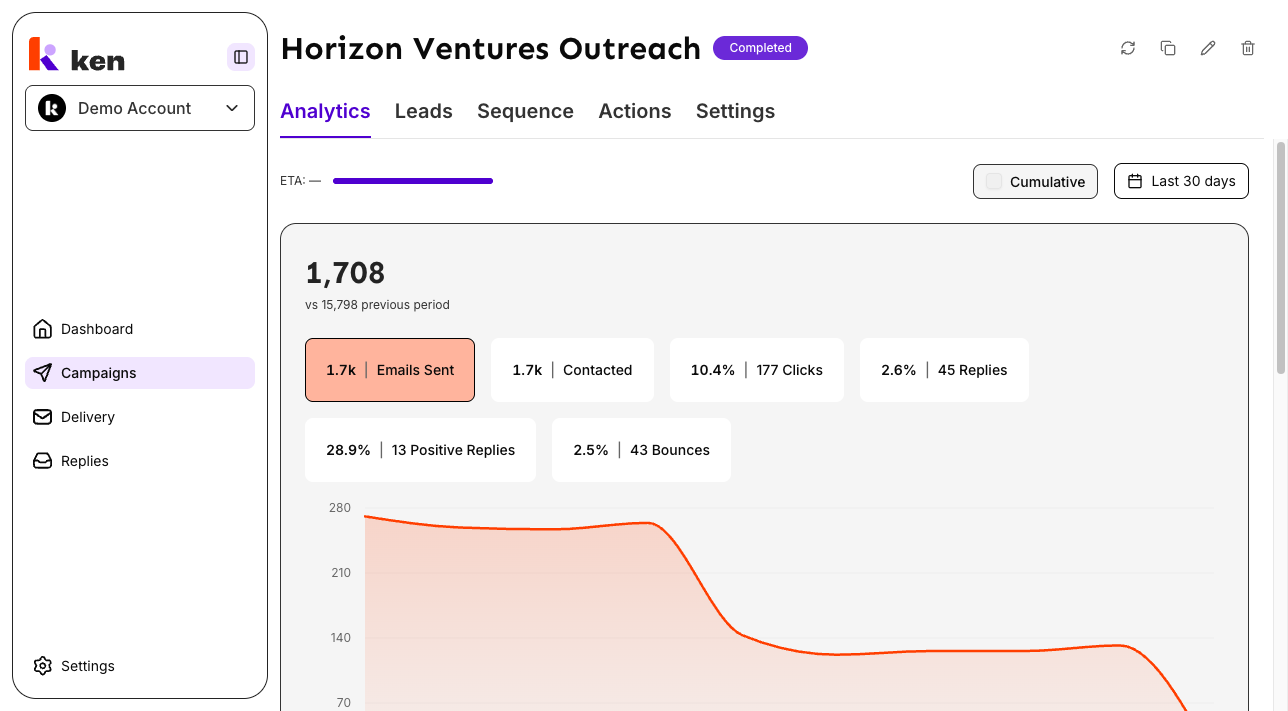
When the Analytics tab loads, the chart defaults to Emails Sent over the last 30 days in daily (non-cumulative) mode.
The six metric pills across the top of the chart let you switch the line:
| Pill | What it measures | |------|-----------------| | Emails Sent | Total outbound emails sent | | Contacted | Unique contacts who received at least one email | | Clicks | Unique human clicks on tracked links (bot traffic excluded) | | Replies | All inbound replies regardless of sentiment | | Positive Replies | Replies classified as positive intent | | Bounces | Emails that failed delivery |
Click any pill to redraw the line for that metric. The large number above the chart updates to show the total for the selected window. Rate metrics (Clicks, Replies, Positive Replies, Bounces) display as a percentage headline with the raw count shown beneath. Count metrics (Emails Sent, Contacted) show the raw count only.
The summary also shows a "vs previous period" delta - a comparison against the window of the same length immediately before the one you selected.
Switch between daily and cumulative view
Check the Cumulative checkbox in the upper-right area of the Analytics tab to switch the line from day-by-day counts to a running total. Uncheck it to return to daily view.
In cumulative mode, the line climbs continuously to the total-to-date. Hovering a data point on the chart always shows that day's own values, not the running total, so a single point never looks like a one-day spike when it actually represents weeks of sends.
Change the date range
Click the date range control next to the Cumulative checkbox. A picker opens with a presets sidebar on the left and a calendar on the right.
Available presets:
- This week
- Last week
- Last 7 days
- This month
- Last month
- Last 30 days (default)
- Last 3 months
- Last 6 months
- Last 12 months
You can also drag across the calendar to select a custom range. Click Apply to apply the selection. Click Cancel to close without changing the range.
Note on multi-month presets: "Last 3 months", "Last 6 months", and "Last 12 months" always resolve to completed calendar months. On June 21, "Last 3 months" returns March 1 - May 31, not March 21 - June 21. This keeps period-over-period comparisons consistent.
Note on weeks: all weekly presets start on Monday.
Read the segment performance table
Below the chart, the segment performance table shows one row per segment in the campaign. Segments are expanded by default and show their per-email-step breakdown.
Table columns:
| Column | What it shows | |--------|--------------| | Email Step | Segment name at the top level; "Email 1", "Email 2" etc. for each step | | Contacts | Ready contacts in this segment and their share of the campaign total | | Emails Sent | Outbound emails sent by this segment (or step) | | Progress | Delivered / sent - emails that did not bounce, as a percentage | | Replies | Replies / contacted at segment level; replies / step sends at step level | | Positive Replies | Interested replies / total replies | | Clicks | Unique human clicks / contacted at segment level; clicks / step sends at step level |
Segments marked Paused are shown at reduced opacity. Segments marked Not deployed have not yet been activated in the sending system.
Expand email steps and A/B versions
Click the chevron next to a segment name to collapse or expand its email steps. Click the chevron next to an email step to expand A/B versions (if any). Each version row shows its send count, delivery progress, reply rate, and click rate.
Hover for bot/human click split
For any segment that has received both human and bot/scanner clicks, hovering the Clicks cell shows a tooltip with the human and bot counts separately. The headline number always shows human clicks only.
How it works
Dual-window fetch. When you select a date range, the system fetches data for that window and for the immediately preceding window of the same length in parallel. The previous-window data powers the "vs previous period" delta shown in the summary cards.
Chart math. Daily stats from the backend are aggregated into a running total (cumulative mode) or kept as per-day counts (daily mode). Every metric field is treated as zero when the backend document omits it - backend documents frequently omit absent fields rather than sending zeros, so this guard prevents a single missing field from corrupting the entire line.
Clicks come from internal tracking only. The click count on both the chart and the segment table comes from Ken AI's own link-tracking system (Short.io redirect webhooks) with bot and security-scanner traffic already excluded. The sending provider's click fields are not used because they report zero for Ken AI campaigns. If you see clicks in the segment table but the chart shows zero, this is a known state - see Troubleshooting below.
Tooltip always shows the day's own values. Even in cumulative mode the tooltip reports that specific day's sends and clicks, not the running total. This prevents a single hover from looking like a one-day anomaly.
Date math. Weekly presets start on Monday. Multi-month presets anchor to completed calendar months. If you leave the date picker open past midnight and then press Apply, the preset is re-evaluated at click time so "This week" always means the current week.
View state is local. Your metric selection, cumulative toggle, and date range are stored only in the current browser tab. They are not saved between sessions or shared via URL. The main dashboard analytics view does encode its state in the URL for bookmarking, but the per-campaign Analytics tab does not.
Troubleshooting & debugging
Symptom: chart shows "No analytics data available"
- Likely cause: the campaign has not sent any emails yet, or no data falls in the selected date range.
- What to check: confirm the campaign is Active and that the selected date range covers a period when emails were sent. Try switching the preset to "Last 3 months" to widen the window.
Symptom: chart line is visible but Clicks shows 0 in the summary card
- Likely cause: a data-source mismatch. The chart reads clicks from internal tracking (Short.io). If the campaign was set up before internal tracking was enabled, historical rows may have no click data even though later rows do.
- What to check: look at the segment performance table. If the table shows non-zero clicks, the chart will update to match once the date range includes those rows. If both are 0, no tracked link clicks have been recorded for this campaign in the selected window.
Symptom: "vs previous period" shows - (dash) instead of a delta
- Likely cause: there is no data for the preceding window (e.g. the campaign started inside the current window and there is no earlier period to compare).
- What to check: widen the date range. The previous window is always the same length as the selected window, placed immediately before it.
Symptom: segment table shows "No segment data available"
- Likely cause: the segment analytics query failed or the campaign has no segments configured yet.
- What to check: reload the page. If the error persists, check the browser console for a "Failed to load segment analytics" toast. Segment data is fetched independently from chart data, so one can succeed while the other fails.
Symptom: phantom step rows like "Email 5" or "Email 9" appear in a sequence that only has 3 steps
- Likely cause: a known issue where the sending provider flattens A/B-variant emails into its own step positions. These phantom rows appear only in legacy aggregated stats. Real Ken AI sequence steps always have version data (Version A, Version B), so the table automatically hides step rows that have no version breakdown when any version data is present.
- What to check: if the step has no version sub-rows (no chevron), it may be a phantom. This resolves itself as newer stats accumulate.
Symptom: "You do not have access to this analytics view" message
- Likely cause: your account role does not have permission to read analytics for this campaign.
- What to check: ask a workspace admin to verify your role. The message appears separately for the chart and the segment table - you may have access to one but not the other.
Symptom: the entire chart line goes blank or every data point shows "-" even though the campaign has sent emails
- Likely cause: a NaN-poisoned running total. A single backend stat document that omits a field (rather than sending 0) can turn the running sum into NaN, which blanks the entire line - not just one missing day. Backend stat documents frequently omit absent fields rather than sending zeros, so this affects campaigns with sparse early-period data.
- What to check: switch to a different metric pill (for example, switch from Replies to Emails Sent). If only one metric is blank and others render normally, the source data for that specific field is absent for the selected window. Try narrowing the date range to exclude the earliest rows of the campaign. If all metrics are blank at once, reload the page and check the browser console for a failed analytics fetch.
Symptom: the Cumulative line tooltip looks like a single-day spike
- Likely cause: this is expected behavior if you are reading the line value rather than the tooltip. The line climbs to the cumulative total; the tooltip always shows that day's own values. The tooltip is the correct number for a single day.
FAQ
Why do the Clicks metric and the segment table sometimes show different values after a date-range change? Both the chart and the segment table are fetched separately and apply the same date filter. If you see a brief mismatch immediately after changing the date range, the table is still loading. Both will resolve to the same underlying data once the fetch completes.
Why does "Last 3 months" not include the current month? Multi-month presets cover only complete calendar months. This keeps the comparison fair - a month that is only a few days in would look like a drop even when performance is normal. "Last 30 days" includes today if you want a rolling window that covers the current partial month.
Can I bookmark or share a specific date range and metric view? Not from the campaign Analytics tab. The selected metric, date range, and cumulative toggle are local to your browser tab and are not encoded in the URL. If you need a shareable view, use the main dashboard analytics page, which does encode its state in the URL.
What counts as a "click"? A click is a unique human click on a tracked link in an email sent through this campaign. Bot traffic and security-scanner traffic are filtered out before the number is shown. The tooltip on a segment's Clicks cell shows the human/bot split if any bot clicks were recorded.
What is the difference between Replies and Positive Replies? Replies counts every inbound reply to a campaign email regardless of what the reply says. Positive Replies counts only replies that have been classified as showing positive intent - interest, questions about pricing, or meeting requests. The Positive Replies rate is the share of all replies that are positive.
Why does the segment table column say "Email Step" at the top level when each row shows a segment name? The column header describes the expandable hierarchy: segment names at the top level, email step labels ("Email 1", "Email 2", etc.) as child rows, and version labels ("Version A", "Version B") as grandchild rows. The header label is shared across all three levels.